Always make certain you are getting the best graphic design service. Utilising professional graphic design can help improve every area of your business resulting in an increased profitability and competitive advantage.
Graphic design is the visual representation of your company online and offline. Here we point out some common mistakes, so you can make sure they are not happening in your organisation.
Too many words, no breaks, and not enough images. It’s a proven fact that we humans retain more imagery in our memories than words.
Content that is too ‘wordy’ and has poor readability tends to lose the interest of the reader very quickly.
Images are key to effectively communicating with your clients and prospects, so use them to enhance your words.

Spacing or ‘kerning’ as the proper term is, can have a dramatic impact on how any piece of graphic design looks. Kerning is how the letters are spaced, unequally spaced characters often look out of place.
Its not just what your content says, its how it appears and what impression it gives to your audience.
Combining fonts and typefaces can be very powerful.
It can also be damaging to a brand if too many typefaces and fonts are used.
Too many styles or fonts or inappropriate combinations give an unprofessional, messy feel and are hard to read.

Too little negative space will make your content difficult to read. Don’t be afraid to use white space to your advantage. It should not be viewed as empty space but rather a very essential part of graphic design.
A lack of white space makes it more difficult for the natural eye to process as there is nothing to focus on.
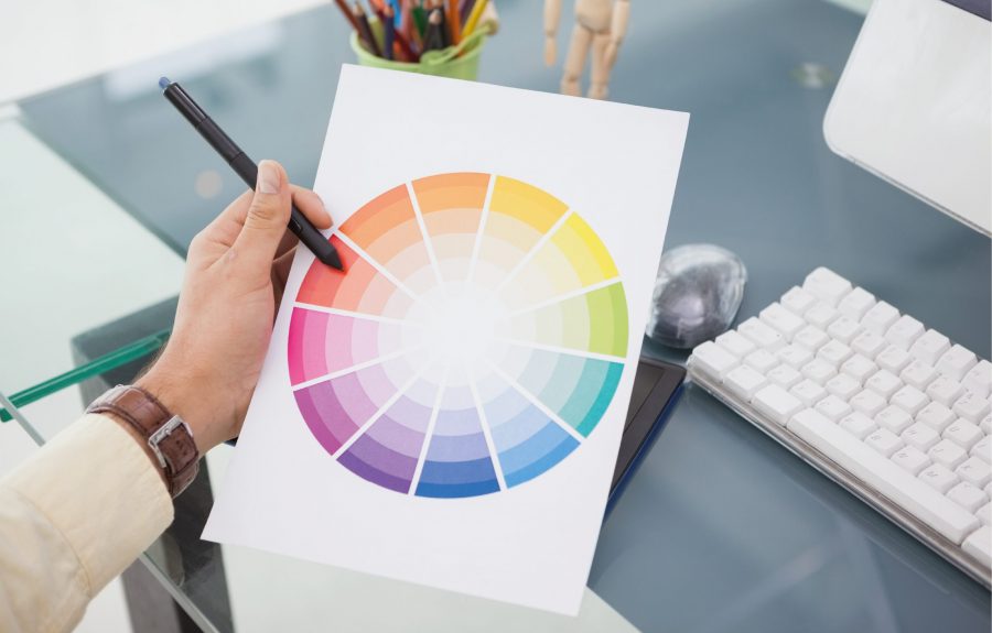
The wrong combination of colours is another mistake that is often made. Contrast between colours is essential to getting the attention of your audience. Light tones on mid-tone backgrounds can be hard to read and even missed.
The use of too many colours together can lead to confusion and give the impression of a child’s colouring book. When choosing colours for your organisation, pick 2 or 3 max.

Poor quality images look unprofessional and can distract from the message they are supposed to portray. Relevance is another point to watch.
If your images are not relevant to your business or topic, they are likely to confuse your audience. Overtime, this can affect the credibility you have from your clients.
Most of us remember an image or font rather than words. It’s so important to ensure that you use the same fonts and colours throughout all of your graphic design.
Lack of consistency can lead to people not trusting your brand.
It’s not that every page of your website should look identical, but that styles and colours should be consistent.

In all this, you must remember that any graphic design for your business is effectively a visual representation of your organisation. Be careful what you publish print wise or online as it can have a positive or negative impact on your potential clients.
Make sure you are using the best graphic design services and creating material that truly represents your company.
Get in touch with us to request your quotation